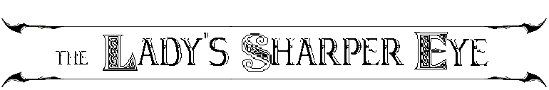
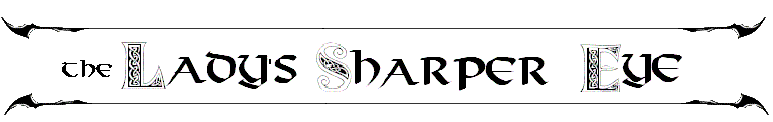
I personally like #5 myself.
Title Image of the LSE
Check out the following images for me - which do you prefer? If we have a tie I may just switch between them. 
They *are* a bit cleaner in the word doc I'm working with so keep that in mind.
- 501 reads
Tue, 2006-04-18 19:31
#3
Title Image of the LSE
Tue, 2006-04-18 19:40
#4
Title Image of the LSE
I like #2 and #3, but only getting one vote I just voted for #2. Depending on how mischeivous I'm feeling, I might occasionally switch my vote between the two 
Tue, 2006-04-18 20:23
#5
Title Image of the LSE
I like #3.
Tue, 2006-04-18 21:13
#6
Title Image of the LSE
I kind of like 4 & 5...
Wed, 2006-04-19 07:08
#7
Title Image of the LSE
It's supposed to have been made on a printing press in-world, isn't it?
Correct me if I'm wrong here, but they all seem to clean for that.
Wed, 2006-04-19 08:22
#8
Title Image of the LSE
This is more a font question than an appearance question. I'll be photoshoping as needed to make everything look stylistic for the setting.
And of course, never underestimate the power of magic to make crisp lines.  I've been looking at some of the old prints from 1700 and they're remarkably clean lined too - the biggest pita for printing of the time was the time involved in typesetting.
Wed, 2006-04-19 09:14
#9
Title Image of the LSE
They're all good, but I've eliminated all but 5 for one reason or another.
#1 looks like a sign for a restaurant or, in D&D, an inn somewhere
#2 looks like the lettering on the spine of a book
#3 is too recognizably basic as Exocet
#4 looks like newspaper print, but Poor Richard's Almanac
#5, though, has that perfect Sigilian blend of being whimsically eccentric and odd-looking, yet still looks like a newspaper trying to seem professional
Wed, 2006-04-19 09:41
#10
Title Image of the LSE
#5, though, has that perfect Sigilian blend of being whimsically eccentric and odd-looking, yet still looks like a newspaper trying to seem professional
Hence why I agree that 5 is the best choice  .
.
-Ophelia
Wed, 2006-04-19 09:59
#11
Title Image of the LSE
It's supposed to have been made on a printing press in-world, isn't it?
Correct me if I'm wrong here, but they all seem to clean for that.
It'd probably be lithography or Automatic Scribe rather than a printing press. I don't know that Sigil has movable type. Grundlethum's Automatic Scribe uses magic to duplicate documents, rather than any mechanical process.
Anyway, I voted #5.
Wed, 2006-04-19 11:16
#12
Title Image of the LSE
I liked 5!
Wed, 2006-04-19 14:22
#13
Title Image of the LSE
Or they could be made by golemic scribes, with as many arms and hands on each side as would fit. Constantly scribing, day and night. I think that would be neat!
-Ophelia
Sun, 2006-04-23 11:35
#14
Title Image of the LSE
#1 has the bonus of readability, if you ask me...
Sun, 2006-04-23 13:24
#15
Title Image of the LSE
If you want the printing press style then its 4...given that it is (or was) a magrag I think thats the style you should be going for. But also I see the point Rhys made about 5...lest we forget the punishment for taking any decision lightly when the decision involves Her Serenity...Good 'ol Metal Head
Mon, 2006-04-24 10:03
#16
Title Image of the LSE
I like number Five!
I would further venture that it might look a bit more eccentric with graphic rendering to the key letters "L," "S" and "E" (in Sigilian motif no less).
Here's a minor example of what I'm attempting to say with the letter "I":

just my two stingers worth . . .
Tue, 2006-04-25 09:50
#17
Title Image of the LSE
I picked the fancier ones I had for fonts. Unfortunately my selection of fonts does not extend to the extremely nifty though I'll keep an eye out for such as this gets rolling again and may make that switch later.
Mon, 2006-05-08 11:34
#18
Title Image of the LSE
I picked the fancier ones I had for fonts. Unfortunately my selection of fonts does not extend to the extremely nifty though I'll keep an eye out for such as this gets rolling again and may make that switch later.
Unfortunately my selection of fonts does not extend to the extremely nifty though I'll keep an eye out for such as this gets rolling again and may make that switch later.I didn't have access to the Watson font  , so I had to make due with MS Paint. I had some free time after frustrating myself while creating the letters I suggested. These two are examples of what I was referring to earlier.
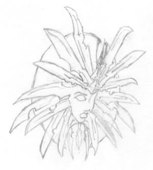
Interestingly enough, while dabbling with some ideas for the Lady from a Greek Sculture/bas relief perspective, I stumbled on an interesting result. I'll post it as soon as I ink it (unless you'd like to see it post haste.)
Tue, 2006-05-09 10:14
#19
Title Image of the LSE
Are those drawn by hand or a font? And yes - I'd be quite interested in seeing it
Fri, 2006-05-12 06:49
#20
Title Image of the LSE
Are those drawn by hand or a font? And yes - I'd be quite interested in seeing it
NO, they were "enhanced" by hand but the letters are individual fonts.
Here's the 20 minute pencil sketch:
Fri, 2006-05-12 09:39
#21
Title Image of the LSE
A side profile shot!? *sweeet* I have never seen a representation of her symbol from the side like that. That looks really really nice.
I like #2, #3, #4 the best.