Now, I only have six of them done right now, and they are not colored in yet, but I would appreciate some feedback on them.
Succubus
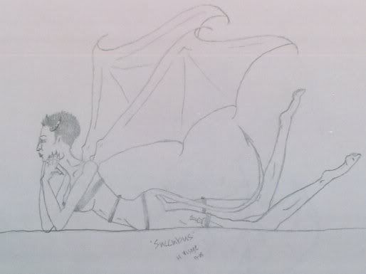
Now, I only have six of them done right now, and they are not colored in yet, but I would appreciate some feedback on them.
Succubus

Here are the:
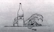
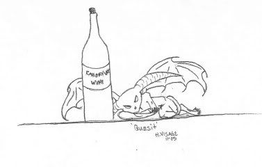
Quasit
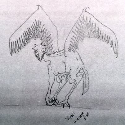
Vrock
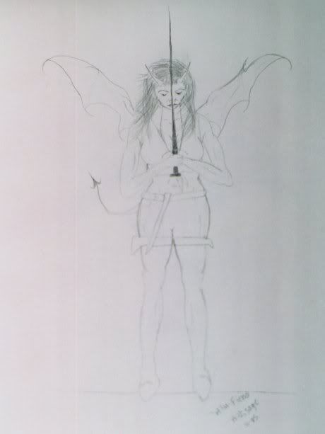
Alu-Fiend
There they all are, or at least what I have so far. Please let me know what you think, constuctive criticism is very much welcomed!
Succubi are supposed to be sexy. I'm not sure why this one isn't. Might be the hairdo.
Scrawny-factor I'd say... that poor thing looks thinner than Kate Moss on a thin day. (Sorry, Ophelia...)
The redone Succubus:
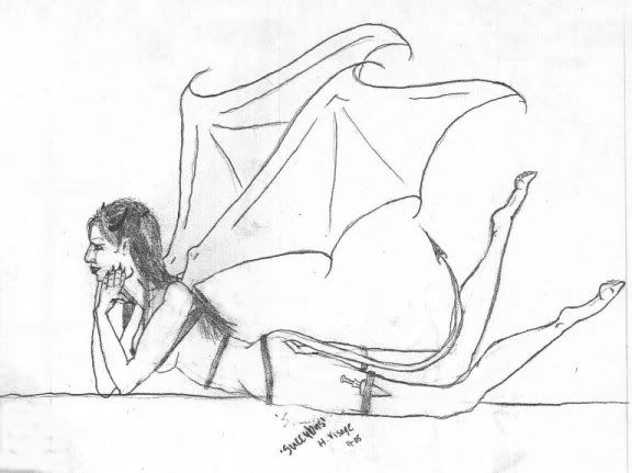
How is this one? Is it still too thin? Or have I made it proportionately correct for what you all have in your heads with this picture?
PS: All those little lines you see that shouldn't be there are from the scanner I used and wasn't able to take out with my Paint Shop Pro, they will be gone when I color it in.
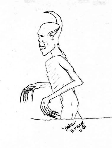
Here is the Babau (I know it isn't perfect, but it is the best babau I have done... having problems with it for some reason), what do you think?
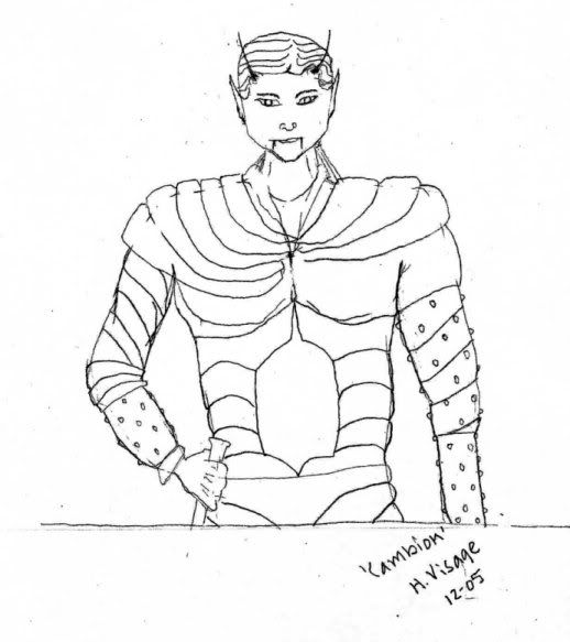
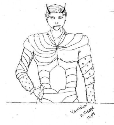
Here is the Cambion (the head is on the small side if you don't take in the factor that he is wearing armor). What do you think?
There you go. Please give me some feedback on these and the rest of them.... pretty please?
Yeah, I think the redone succubus looks better.
Here is a varient Succubus from the one I origonally started with:
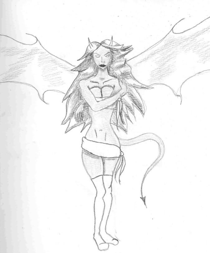
I think that this one is MUCH better. Tell me what you all think, pretty please?
definatly better.
Here is a better picture of the Alu-Fiend:
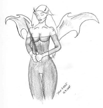
Tell me what you all think, ok?
The proportion's off on the succubus; its legs are much too short.
I would try to avoid such harsh outlines as well.
I will fix the proportions on the Succubus' legs, and those harsh outlines will go away when I color everything in  .
.
Thanks for the input everyone! Please keep it coming! I haven't gotten any feedback yet on any of the other pic.s except the Succubus, so plese look them over and give me some input, please?
Okay then (cracks knuckles) you asked for it.
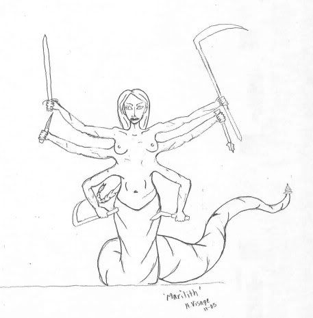
Marilith: The eyes are off center, and kinda weird. I think the arms are two thin, and it may look beeter if it had some sort of battle scars, thy are fighers, after all.
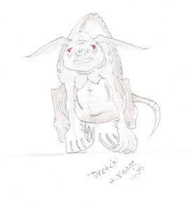
Dretch: I like, but It may be better it it was'nt from a heads on view.
Alu-fiend: I like the new one. Much better, the first one looked very two dimensional.
Vrock: I love it.
Quasit: It seems too cute. I know that they're not supposed to be very imposing, but that one looks like a pet.
The Cambion doesnt seems very fiendish, just evil. Horns might do the trick.
As for the Babau, I like it, actually.
Those are just minor details I think you should fix. All in all, I really like your drawing stly, and I think it fits well into the original feel of planescape.
Thanks Fridrikon! I needed some constructive critisism on ALL of them and you gave it to me. I really appreciate it more than you know!
-Ophelia
Note: Here's a Quasit I drew, I'll put it in Artist's Alley if nobody wants it probably...
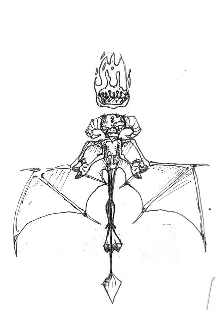
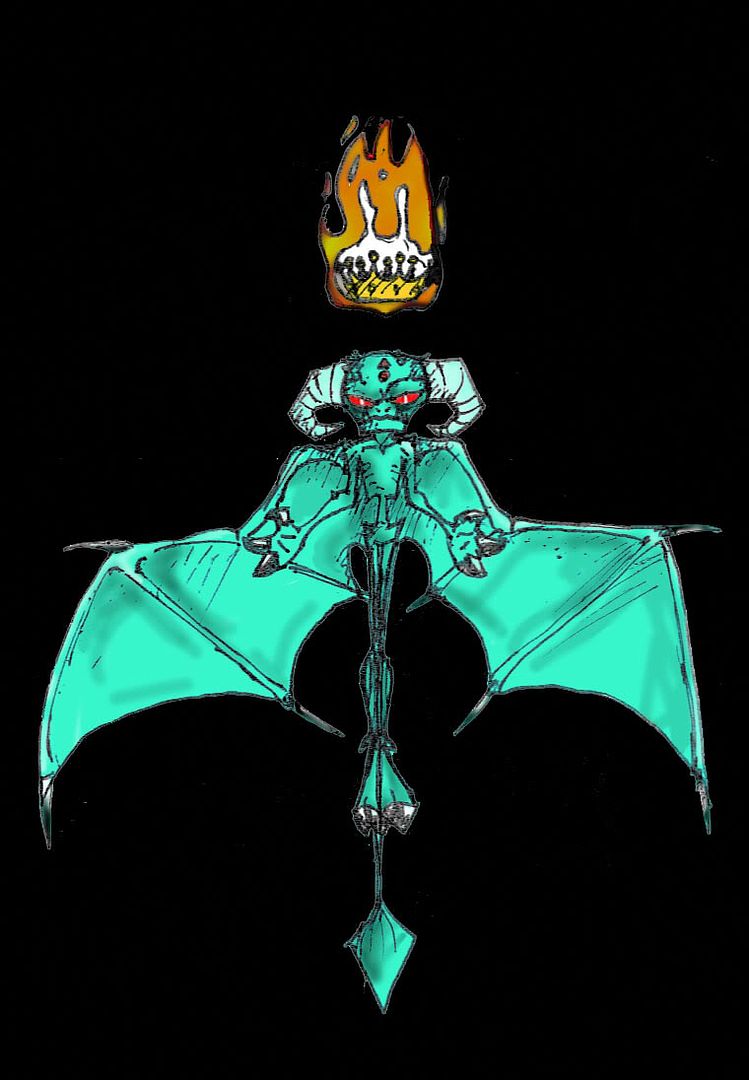
Ergh, that's an old scan... I'll try and work it out in Photoshop so it... you know... looks... not ew.
Ok... here are some new drawings and some redone ones that I have already posted:
Bar-lgura
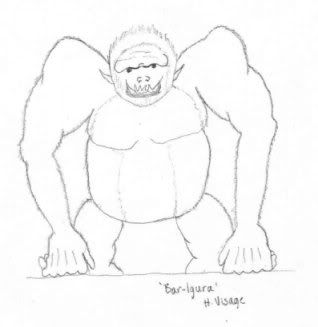
Re-Done Cambion
Some color for the Dretch(NOT the OFFICIALLY done coloring) I will do that later:
Marilith with thicker arms and centered eyes and battle scars:
Re-Done Quasit (hopefully this looks more like "My PreCious WiNe!! Mine! and not so much "Oh, I've drank SO much wine I fell asleep all cute"):
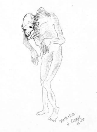
Rutterkin (this one didn't scan very good, but you get the idea):
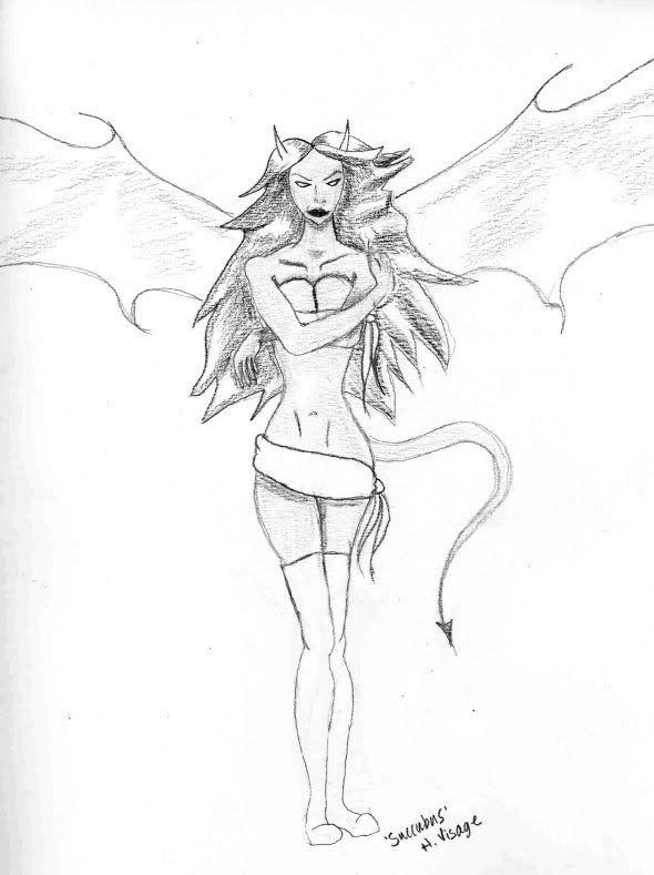
Succubus with longer legs, better proportioned (at least I think so):
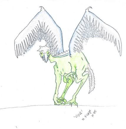
And the Vrock with the color scheme I am going to use(NOTE: that this is not the finished product, just like with the Dretch, I will be most likely painting them all):
OK, so I am asking AGAIN for more constuctive critisism...Pretty please just let me know what you think of all the new ones, ok?
Thanks!
Ophelia
The reproportioned succubus looks much better. The vrock colouring looks off, but that could be mostly because I'm used to the purple vrock in the MM. There's no reason a vrock couldn't be green, though - tanar'ri never were very big on conformity.
Pants of the North!
Make the succubus' legs a little longer still. The human ratio is two head-heights for the torso including the neck (three including the head), one head-height for the pelvis, and three head-heights for the legs. That's seven head-heights in total, plus about a quarter head-height for the feet (from the ankles down). The contemporary "fashion model" ratio adds another head-height to the legs, usually with Photoshop. As a somewhat idealized form, succubi should probably use that standard.
It might be helpful, Ophelia, if you look at real people as references. Try Google Image Search to find some quick models.
And see this page: http://www2.evansville.edu/drawinglab/map.html. Pay special attention to the section on proportions - all your figures are a little off.
Rip, I read through that site you sent me and really checked my proportions. The last Succubus is perfectly proportioned compared to the model on the site. I think that it is that low sash around her hips and the high boots that may be what is making you think she is off.
The Cambion is slightly off proportion (ie:his body is a little short). The Rutterkin is off because he is supposed to be ill-proportioned. And the Alu_Fiend's body to head proportion is right on, compared to that site. The rest of my creatures are not ill-proportioned because there is no pallette to compare them to.
If you disagree please tell me why and explain yourself more plainly, like you did in one of the above posts :
I believe the Succubus meets these standards now. I measured it out with a ruler on the paper. If I make her legs any longer they are going to be too long.
By the way, thank you very much for the link. It will and has come in really handy! 
The Nalfeshnee (gods above and below these are silly looking demons!):
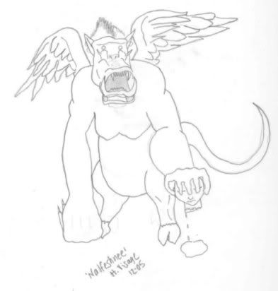
The head in the hand might be a bit much. Let me know what you all think, ok?
I like the face of the Rutterkin, it's scary. and the latest version of the succubus is also good, meaby giving here some jewels or such.
The wings of the vrock are too flat, and I think the green is to harsh, meaby giving it a more brownish-green would make it more realistic.
The nalfeshee looks good, and i like the idea of more body parts and bloody details  . But as far as i know the book should be for all ages
But great work! keep it on
Here is a Balor (trust me, it will look MUCH better when it is painted in):
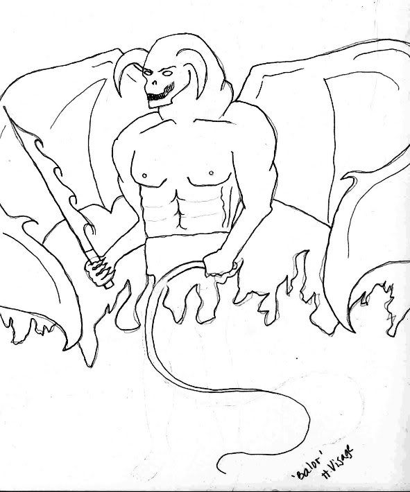
-Ophelia
you did very well on taking the criticism Ophelia, i myself suck at taking criticism (doesnt stop fridrikon though) haha. but if you really want it, i know youve probably redone that sucubus a million times and it looks quiet nice, but just to give it a more realistic look, her breasts wouldnt make such harsh circles, it would be more of a smudged look, not so pronounced. and maybe the whole controversy with van over her legs is that its not that they're too long but, from her hips to her thighs its ok, but the tapering down into the knees is perhaps to abrupt, which may have brought the knees up to high, which in turn seemed to stretch out the lower calf area, and made the legs seem too short, too long, something, but maybe thats the problem. hope i helped and didnt harm.
oh and im sure Fridrikon will see me participating in all this and he'll maim me for not working on my eladrin final copies, and so i say to him , good sir! the rough drafts are done, (some hehe) and i will you to scanith them and i shall post away, for confirmation from others, then shall i begin the finals. actuallly i dont care what they or you say about my first guy, hes so cool i wanna keep him forever.
It looks like the balor's forearms are too skinny. I mean, a balor could, I suppose, be slim, but his arms don't look right compared to that thick, powerful torso.
Pants of the North!
The arms aren't bad, actually, though the muscular and skeletal structure in the torso could use a little touching up.

Note where the ribs are. No matter how muscular he is, the ribs make a difference. You can see the ribs between his pects and angling down underneath them.

Also, look at how the abdominals are shaped and how they fit relative to both the pectorals and the muscles on the side of his torso.
I don't mind that the balor isn't proportioned like a human, incidently; he doesn't need to be.
Also, you might want to think about using contropposto positions in the more humanoid demons; that means one hip turned up like the ones on this page.
So that the body makes an s-curve.
It adds a slightly more sensuous, less stiff, more "naturalistic" image
I think the nalfeshnee is quite good, by the way.
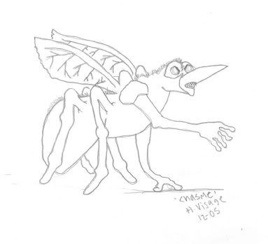
Here are the rest of the Tanar'ri:
Chasme:
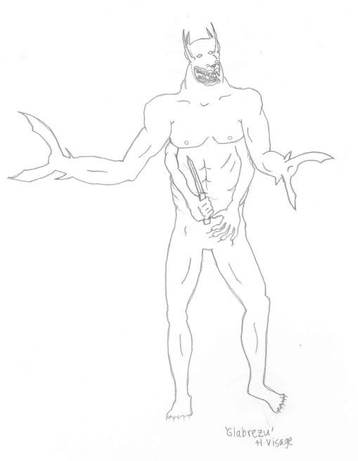
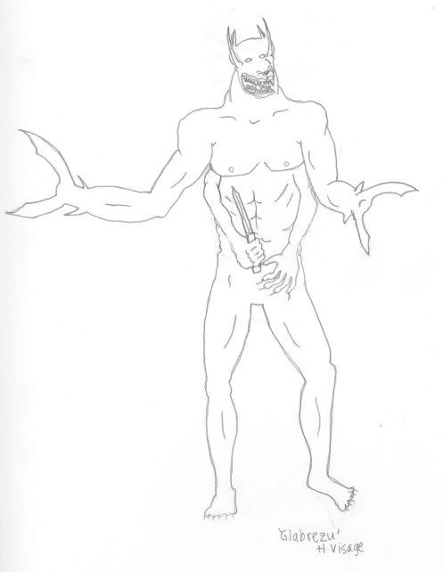
Glabrezu
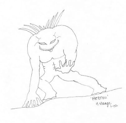
Hezrou:
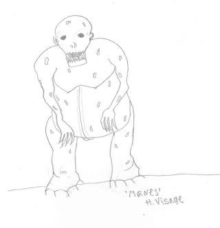
Manes:
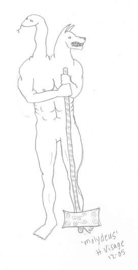
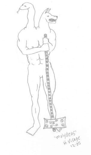
Molydeus:
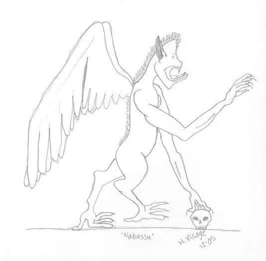
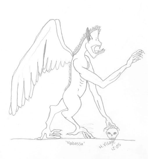
Nebassu:
Wastrilith:
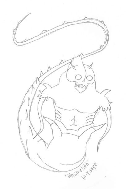
So there are the rest of 'em. Tell me what you think can be improved, or let me know if any of you like any of them (that would be nice too  ).
).
Hello Ophelia.
You do have the personalities of the beings well done in the images.
I like the first guy a lot. 
On the other ones might I suggest giving them a bit more curve. For the Glabrezu you have the parts where they should be, but his torso from the chest down is bulged out. And his ribs go too far straight down his body. They would be more angled.
When I do the male form (especially for those big muscular boys) I like to make their torso to their shoulders almost like a triangle. The shoulders would be the base of the triangle and then their body would slim down from there. But remember that the male body is not square, they do have the most subtle curve in the waist area and pronunciation where their ribs are located. Your image of the Molydeus is also a little too square.
I would say look at the bodies of body builders or guys like pro wrestlers and stuff and see how their torso's are situated.
Really though they are coming along nicely, and with a little more work on anatomy I'm sure you're gonna blow people away with your ability.
You've got the talent. 
btw your standing succubus, I like her face. 
Ok here are some of the redone pictures:
Glabrezu:
Molydeus:
Nabassu:
Do they look better?
BTW, I just wanted to say a big THANK YOU to all the people who have posted on this thread and helped me out with my drawings. It has helped alot! Thanks!
Ophelia
Some humble sigestions:
Glabrezu:
- Draw Schwarzenegger, now erase his head and draw a doberman's head connected to the neck or even a more bloody anubis head. A pitbull's or rottweiler would also be a good idea. Check out the big monster from "We 3" to get a good idea of a atrocious dog. Cerberus as a last resort.
Now append other two similar arms to the torso, but replace the hands for lobster claws (attetion for the little balls on the surface, they're important details).
The concept for Glabrezu is really good and rather hard to come up with, so congratulations.
Molydeus:
Why not trying the same and putting the snake to com e out from somewhere really scary, like the dog's throat?
The hammer could as well be more rounded, if you look at the hammer in "Mario RPG: Legend of the Seven Stars", you should get a good idea of what I am talking about.
The Nabassu is really well-conceived. It looks like a bat to me, so why not connect his wings to his arms? He needs only to be made more demoniac. It is really good indeed. About the skull, making it more real will considerabily ger the art better.
I really took the artistic side of the thing. Unfortuantely, I do not know of I attained to the concepts in the books, so regard my sugestions for as long as they are relevant.
Keep on with the good work and search the internet for a techinque called cross-hatching (or just hatching, which is a good one too). This is a shading technique that, when well-used, makes the drawing simply spectacular. Just take a look at a manga named Berserk to see what I mean.
I hope I was able to help.
The Molydeus has an extra snake head off of his neck  it can't be out the mouth
Excelent idea, although it might prevent the bad guy from biting... Unless, of course, another mouth is put on his belly.
Cambion can be improved... enhancing its armor. Succubus is really sexy, but do not be afraid to make it look liek an evil version of Striperella.
Can I draw and post some stuff here too?
I'm sure you would be welcome, although I'm inclined to suggest it go in your own thread.
Pants of the North!
This thread is actually unofficially closed, though you may still post here, the drawings were fixed months ago and colored in and sent off to (Who I assume is one of the editors) and to Clueless. So there is no reason to post anything more in this thread.
If you want to draw and post things your're best to do it in the "Civic Festhall" where art belongs really. This was just a special project for myself to work as a PSCS Illustrator. If you are interested in becoming one then perhaps you should PM Clueless.
-Ophelia
I am not THAT good to be an illustrator (neither do I have enough time for that)... But I will take your sugestions on the thread, thanks.

Marilith
Dretch