Faction symbol preveiw

37 posts / 0 new
Last post
Fidrikon's picture
Offline
Factor
Joined: 2004-12-19
Faction symbol preveiw

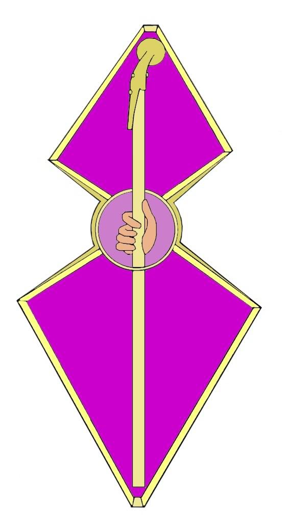
Okay, I plan on posting pictures in advance of the faction symbols I draw, so I can get a bit of feedback before it is actually submitted. Starting with the Mind's Eye.

Behold!

If you see anything that you think I need to change, or work on, feel free to let me know.

Clueless's picture
Offline
Webmonkey
Joined: 2008-06-30
Faction symbol preveiw

What did you use to make it? All digital I assume from the rough edges?

Fidrikon's picture
Offline
Factor
Joined: 2004-12-19
Faction symbol preveiw

Hand drew it, and colored it digitally. Whenever I color a picture with pencil and whatnot, something always goes horribly... drasticly wrong. I... I dont want to talk about it.

Seriously, I do it on the computer so I can try diferant color schemes and whatnot. If you want me to smooth the edges, I can.

Clueless's picture
Offline
Webmonkey
Joined: 2008-06-30
Faction symbol preveiw

Think of this as something that you would be looking at in a book, so... Things to work on:
Smoothing the edges is *definately* something I'd suggest doing.
The face on the dragon is seriously washed out by the whitelight effect that you have there. Also has a pretty serious underbite going on there.
And the back ridge of the dragon looks pretty rough, like it was just polopped down on top of the rest of the form, it's almost too stylized in comparison to the rest of it.
In the wavey bit at the top - you want to even up the curve on the bottom side to be more symmetric.

Things to keep:
Your strongest point is the gradient use - you have that down Perfectly. It really does a good job of conveying a sense of depth.
Color choice is perfect.
The overall layout of the image is strong as well - the curve of the dragon is a good form, keeps the interest.
The sword is dead on in form, and pretty much in shape and shading.
The wavey bits at the top are well done.

It's a solid rough draft really. I'd suggest possibly printing it out and taking time with the line art to get the curves going smoothly before tossing it back into the digital realm.

Ideally I don't want any of our artists to get picked on by our audience for what they put into release - hence I try to get our folks solid reviews etc in advance - b/c the wild world of fandom can get really mean. Save you and me both the hassle. Eye-wink

Fidrikon's picture
Offline
Factor
Joined: 2004-12-19
Faction symbol preveiw

Okay then, I'll get right on that. Thanks for the feedback!

Clueless's picture
Offline
Webmonkey
Joined: 2008-06-30
Faction symbol preveiw

NP. Smiling I always get nervous giving reviews b/c I'm never quite sure how the reviewee is gonna take it. Eye-wink

Fidrikon's picture
Offline
Factor
Joined: 2004-12-19
Faction symbol preveiw

I know this is another rought draft, just wanted to make sure this was more in the right direction than the other one. I know the coloring would have to be better, and slightly less rough edges. But hows this version?

blackthornes's picture
Offline
factotums
Joined: 2005-04-21
Faction symbol preveiw

I think it looks alot better sense you got rid of the white wash out.

OpheliaWhispers's picture
Offline
factotums
Joined: 2005-05-27
Faction symbol preveiw

There should be some lightening of the top part of the belly near where the eyes reflect upon it. Maybe a little more definition, on the outline only, of the eyes. Other than that, it looks good. Laughing out loud

Fidrikon's picture
Offline
Factor
Joined: 2004-12-19
Faction symbol preveiw

Ive checked through the puplished Faction area of the PSCS, and It seems that the symbol for the Fated has definatly changed, the Athar is to be differant as well. The symbol for the Bleak Cabal seems to have changed, but not drasticly.

Fidrikon's picture
Offline
Factor
Joined: 2004-12-19
Faction symbol preveiw

Okay, I think I might be closer to the mark this time

OpheliaWhispers's picture
Offline
factotums
Joined: 2005-05-27
Faction symbol preveiw

I like it alot Laughing out loud . In my mind that looks alot like a finished product.

blackthornes's picture
Offline
factotums
Joined: 2005-04-21
Faction symbol preveiw

I like it too, It's really good.

Fidrikon's picture
Offline
Factor
Joined: 2004-12-19
Faction symbol preveiw

And heres the Sodkillers. (And yes, I know, the snakes heads are crud.)

taotad's picture
Offline
Namer
Joined: 2004-05-11
Faction symbol preveiw

I like the simplicity of that one.

Maybe filling in the red with shades of some unknown symbols to get the "feel" of the original PS iconography tradition?

Just nitpick. Its a keeper like that in my book.

Clueless's picture
Offline
Webmonkey
Joined: 2008-06-30
Faction symbol preveiw

The inside on this one is darned near perfect the way I see it Smiling
The only thing I might adjust is one of two ways:

1) Drop the snakes into just a green ring... or
2) Thicken the snakes so you have more space to work with as you're drawing them.

The LothyLoth (Shemmie) leaning over my shoulder suggests mixing in a barbed wire edging. Eye-wink

Fidrikon's picture
Offline
Factor
Joined: 2004-12-19
Faction symbol preveiw

Hmmm... barbed wire you say? That seems very... Sodkiller.
However, Id like to keep the snakesm at least in some form. Because the descriptions describes the symbol as a rust-collored fist on a blood red background, ringed by serpents.

On another note, what about Ravorvine, rather than barbed wire? And is it possible to change the description in the PSCS, very slightly, to change the serpent part to something else?

Clueless's picture
Offline
Webmonkey
Joined: 2008-06-30
Faction symbol preveiw

Hm. It'd be hard if the faction is written up in canon someplace with that description. I'll find out from moogle if that was a description we came up with or wotc came up with. One we can change, the other we can't. In the meantime, I'd go with thickening the snakes up so you can put more detail into them and make them look a little tighter. (Remember, snake heads are roughly about the same width as their body so there's no need to triple the size of the head when you draw one.)

OpheliaWhispers's picture
Offline
factotums
Joined: 2005-05-27
Faction symbol preveiw

I like the idea of the snakes all devouring each others tails, not just biting on them. Just a thought....

Primus, the One and Prime's picture
Offline
factotums
Joined: 2004-05-11
Faction symbol preveiw

Maybe this might help.... I made a new faction symbol for the Athar using the PW description quite some time ago:

Fidrikon's picture
Offline
Factor
Joined: 2004-12-19
Faction symbol preveiw

Sweet. That great, and this means I dont have to show the one I had been thinking of. I could never get it to look right. * Burns design. *

With your permission, I'll redraw that at the requested five inch size.

and did we ever get any info on the if the snakes are canon or not?

Fidrikon's picture
Offline
Factor
Joined: 2004-12-19
Faction symbol preveiw

The Sons of Mercy:

Its official. After this drawing, I hated hands enough that, for a time, I debated on if I actually needed my own.

Fidrikon's picture
Offline
Factor
Joined: 2004-12-19
Faction symbol preveiw


The Bleak Cabal. I think this one will work for a faction that is about as enthusiastic about its faction symbol as it is for everything else the multiverse has to offer.

Fidrikon's picture
Offline
Factor
Joined: 2004-12-19
Faction symbol preveiw


Fated Faction symbol!

By the way, did we ever get any info on the who 'sodkiller, ring of snakes' thing?

Zenosaga's picture
Offline
Namer
Joined: 2006-06-23
Faction symbol preveiw

I personally think that the faction symbols should be uniformly designed as an image of roughly equal width and height, similar to common family crests and emblems. I will use the PlaneScape: Torment faction symbols as examples and possible resources, some of which can still apply in PlaneScape after the Faction War.

Revolutionary League:

Dustmen:

Believers of the Source:

Free League:

Mercykillers:

Society of Sensation:

Xaositects:

Clueless's picture
Offline
Webmonkey
Joined: 2008-06-30
Faction symbol preveiw

'Primus, the One and Prime' wrote:
Maybe this might help.... I made a new faction symbol for the Athar using the PW description quite some time ago:

I like that - Does anyone have a larger version of it so it can be easily sized down or used in large?

Clueless's picture
Offline
Webmonkey
Joined: 2008-06-30
Faction symbol preveiw

'Zenosaga' wrote:
I personally think that the faction symbols should be uniformly designed as an image of roughly equal width and height, similar to common family crests and emblems. I will use the PlaneScape: Torment faction symbols as examples and possible resources, some of which can still apply in PlaneScape after the Faction War.

With the glories of Photoshop I can make any set given at a reasonably large size match the same size in the end. That's the reason I didn't mention synching up the sizes. In fact, I'd rather they were larger for just that reason. All the designers need to remember is to make them roughly the same *shape* so they work when reduced - square, or maybe a little taller than square.

Xaos_Bob's picture
Offline
Namer
Joined: 2005-01-31
Faction symbol preveiw

I love the Athar symbol. Any chance we can convince you to do a few more, Primus?

mmxbass's picture
Offline
Namer
Joined: 2006-08-25
Faction symbol preveiw

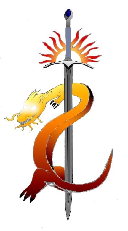
How is this for the Doomguard symbol? Probably could be done better, 5 minute photoshop job but still.

Rhys's picture
Offline
factotums
Joined: 2004-05-11
Faction symbol preveiw

Doomguard looks good, but I think it's a little off-center. Maybe move the cow skull down and slightly to the right.

Calmar's picture
Offline
Namer
Joined: 2006-06-07
Faction symbol preveiw

I don't know... looks a bit like that:

http://www.nuff.org/images/FibroidUterusRGB.jpg

Eye-wink

__________________

"La la la, I'm a girl, I'm a pretty little girl!"

--Bel the Pit Fiend, Lord of the First (in a quiet hour of privacy)

Mik
Mik's picture
Offline
Namer
Joined: 2006-10-26
Faction symbol preveiw

Hope I'm not out of line... I've just lurked up until now. Something possessed me to try a Sodkiller logo, which I've (hopefully) attached below.

Image Hosted by ImageShack.us

=Mik
(phew, that took a couple of tries!)

Iavas's picture
Offline
factotums
Joined: 2006-07-12
Faction symbol preveiw

Welcome, Mik!

Your design is not out of place at all. In fact, I think it's awesome. I love the simple but polished effect you have going. Very stylistic. Since I don't have the description handy, I can't really critique it for accuracy. So, until I do (I'm a stickler for accuracy), A+. Smiling

Hymneth's picture
Offline
Namer
Joined: 2006-08-01
Faction symbol preveiw

Wow. That last one is superb. You get a cookie, Mik!

Tae.'s picture
Offline
Namer
Joined: 2006-09-20
Faction symbol preveiw

Yup.Excellent design, just looks like the sort of thing you'd see on some sort of Faschist( Are Sodkillers fachist? "shrugs") recruitment poster.

nick's picture
Offline
Namer
Joined: 2006-11-27
Faction symbol preveiw

I want that on a shirt Laughing out loud Is it possible to get that on a shirt?

nick's picture
Offline
Namer
Joined: 2006-11-27
Faction symbol preveiw

I want that on a shirt Laughing out loud Is it possible to get that on a shirt? Milks sodkiller logo.

Planescape, Dungeons & Dragons, their logos, Wizards of the Coast, and the Wizards of the Coast logo are ©2008, Wizards of the Coast, a subsidiary of Hasbro Inc. and used with permission.